
Tod is a concept I created for a University branding identity project. Tod is a solo dining 'caff' style establishment. The concept is inspired by the idea of ‘Solo culture’ in Japan where there are many traditional style restaurants dedicated to ‘Solo dining’. The brand draws on the concept of ‘The Salaryman’ and Japanese B movies and the British equivalent of ‘The City boy’ and cult classics such as ‘This is England’. The brand uses a simple palette of just two colours, red and off white which is a nod towards the brands Japanese inspirations as well as British ‘Caffs’.
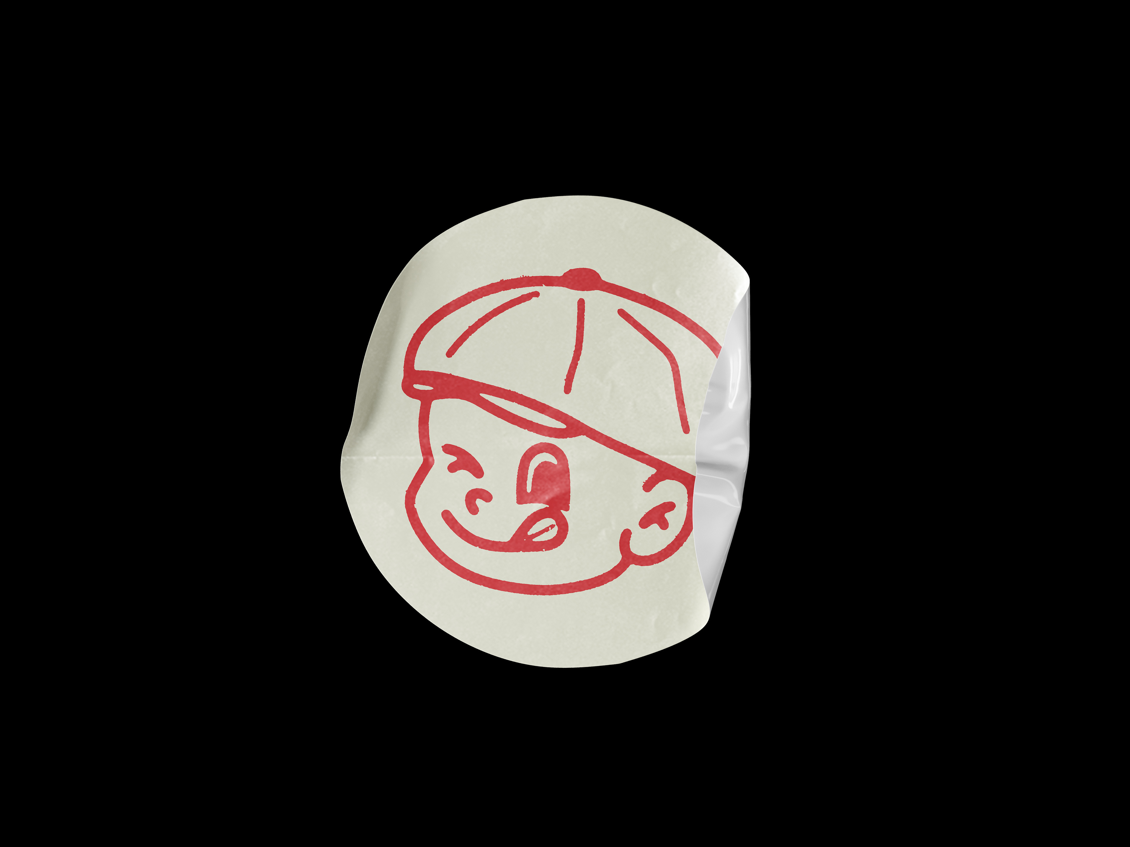
All layout work is formatted as a single column to put an emphasis on the ‘Solo’ concept of the brand. The logomark is a character which also pays homage to the Japanese restaurants/diners that Tod draws inspiration from. The ‘Tod’ character is in a working mans cap, to link the brand to the culture of the UK audience I am targeting, however the hat can change as a dynamic element of the branding.


The Tod menu is a single column to follow the brands guidelines. It would be printed on a lightweight recycled paper stock as a new menu is used per customer due to it being a ‘tick sheet’ for orders. Customers are given a pen with the menu to fill it out.
Instead of gift cards Tod has scratch cards with prizes up to £100 restaurant credit. This is because the target audience is the ‘City Boy’ often city traders, suggesting they like to take a chance. A scratch card is also more engaging than a simple restaurant gift card and adds an element of fun.
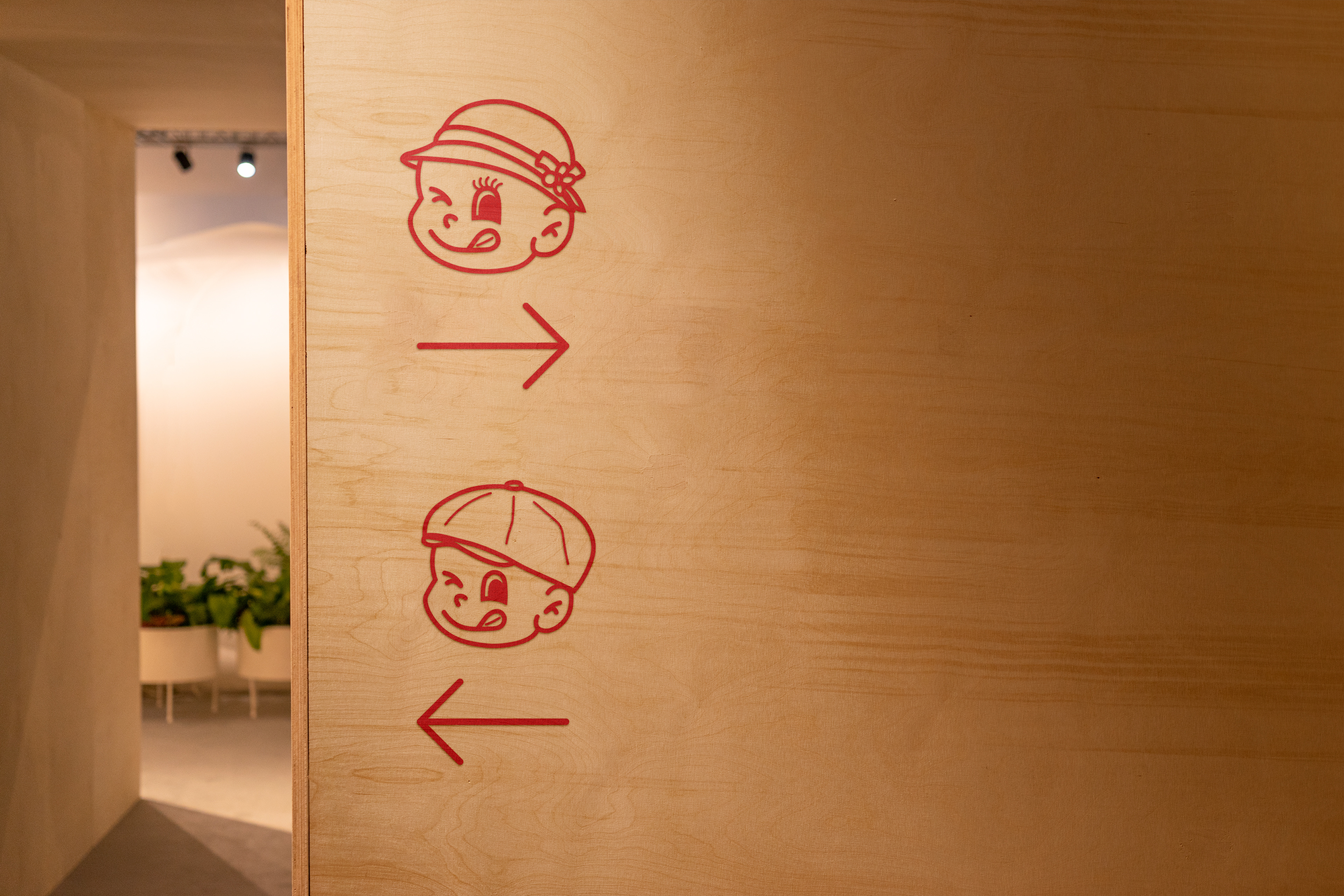
Signage in the restaurant follows the branding, using Tod characters and icons with rounded caps all in red #ED1C24 and again in a single column.
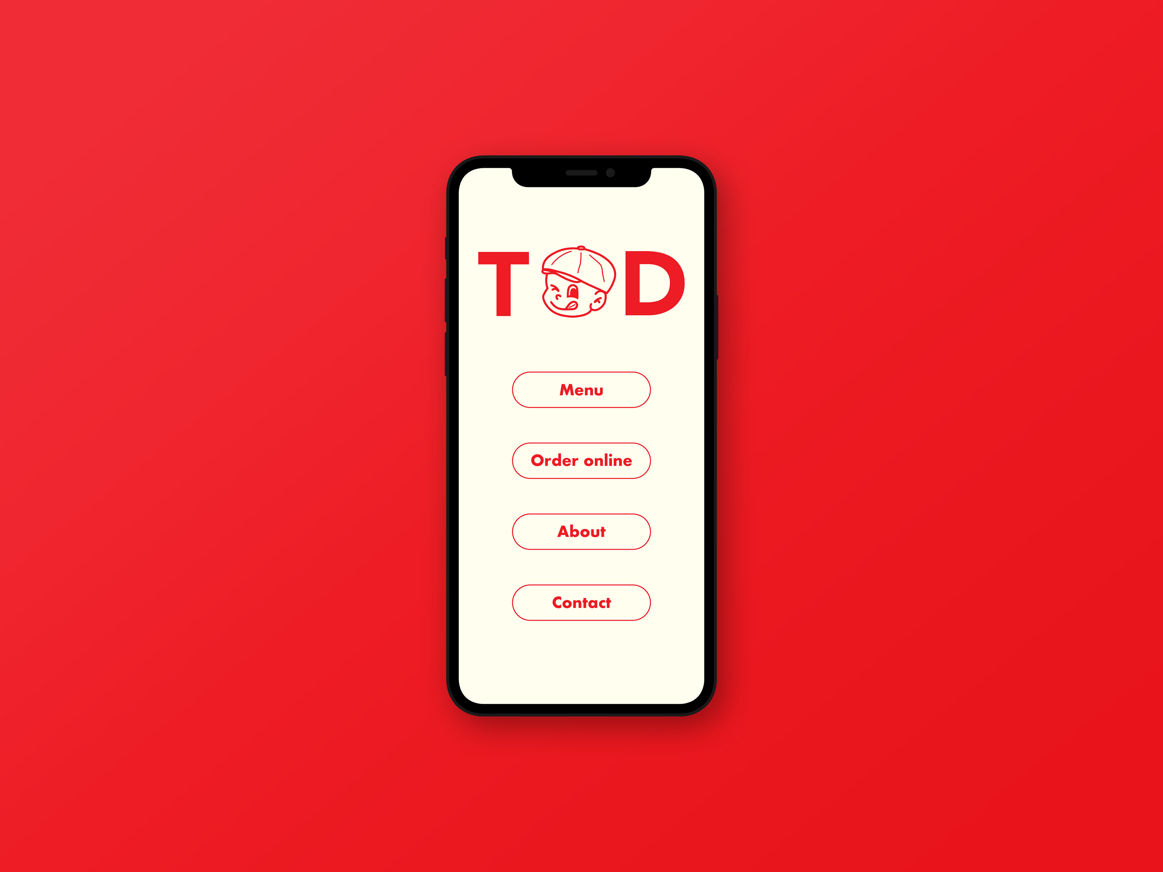
The mobile website features a main menu with buttons leading to a full restaurant menu, an order page, an about page and a contact button.
The animation uses matting and scrolling. It is used as the landing page on both the app and website and can also be used across different social media platforms and TV as a form of advertisement.